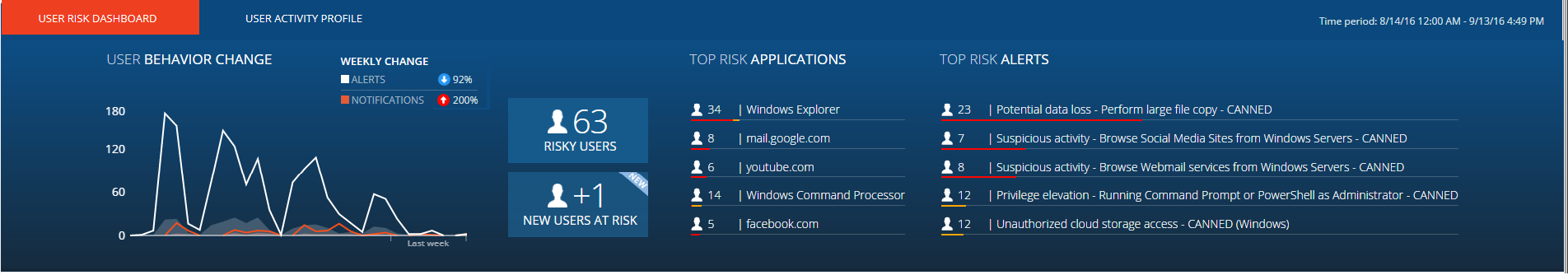
Tracking Overall Risk and User Behavior
The User Behavior Change graph is displayed at the top left area of the User Risk Dashboard, providing an overall view of user risk and behavior trends over a period of time.
The default Analytic period during which the ObserveIT_Analytics database collects data on risky users and actions is one month, which means that all data is based on the last 31 days.
The Time period displayed in the top right corner of the Dashboard reflects the actual data range. For example:

The User Behavior Change area of the Dashboard contains the Risk Graph and Behavior Graph.
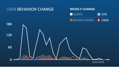
Risk Graph
The Risk Graph (indicated by the white line) shows the overall risk. The white line indicates the risk, which is defined by the total number of alerts created on a single day for all users in the current scope (depending on permissions and risky users display filtering). All alerts are considered equal from the aspect of risk level. The inclination of the white line increases as more alerts are generated. The more alerts that are generated the higher the incline of the graph.
Any alerts that are generated while the user is offline will be created in the database when the user is online; however, these alerts will still be included in the count for the day on which they occurred.
The (gray) area under the Risk Graph shows the risky users. This area represents the number of users for which at least one alert was generated every day. It shows the correlation between the number of alerts (shown by the white line) and the number of users whose actions caused these alerts to be triggered. Note that just a few users could create many alerts or many users might each create just one alert.
Behavior Graph
The Behavior Graph graph (indicated by the orange line) shows the number of out-of-policy notifications that were displayed to users every day. Notifications that the user did not see (because the user was offline or only the last of many notifications were displayed) are not counted. The more notifications displayed, the higher the incline of the graph; the fewer the notifications, the closer the line will be to zero.
If the Behavior (orange) line and Risk (white) line coincide, this means that every triggered alert also displayed a notification to the user.
The (orange) area under the Behavior Graph shows the total number of users who actually viewed a notification every day. If there were no notifications, this area is not visible.
Viewing Daily Risk and Behavior Values
When hovering over the User Behavior Change graph area, cross coordinates (with X and Y axes) appear showing:
-
X: the day and date
-
Y: the RISK or BEHAVIOR value
For example:
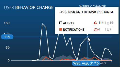
When the cross coordinates meet on a point on either the RISK or the BEHAVIOR line graphs, a blue circle appears.
Hovering on the blue circle displays a tooltip with the following information (as shown in the above example):
-
ALERTS: Number of alerts generated (114) and the number of users that received alerts on that specific day (16)
- NOTIFICATIONS: Number of out-of-policy notifications displayed (6) and the number of users that received the out-of-policy notifications on that specific day (2)